
Accessible Tailwind Design System Component Suite
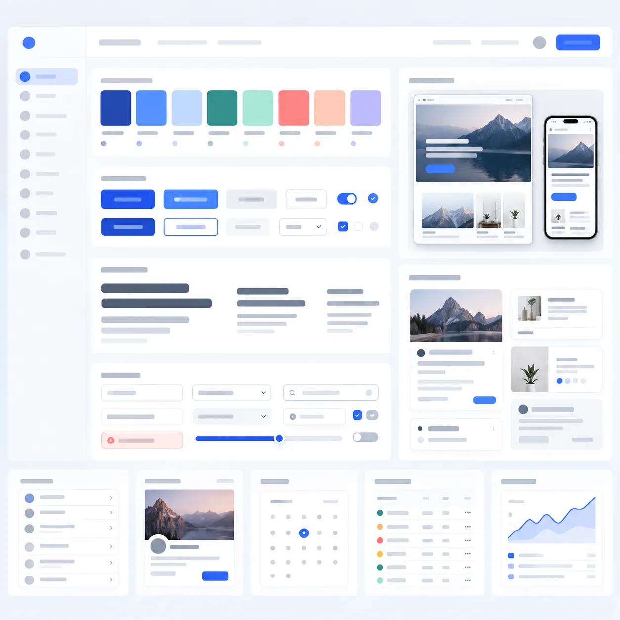
Generates a live interactive component playground showcasing buttons, inputs, modals, toasts, and badges with light/dark toggling.
Customize Placeholders in Real-Time
Swap in your brand color tokens and custom font families.
Develop an Interactive Design System Showcase as a Claude Artifact.

Components to showcase:
1. Buttons: Primary, secondary, outline, destructive, ghost, with loading states and icon variants.
2. Form Inputs: Text, password with visibility toggle, select dropdown, checkbox, radio group, and slider with live value display.
3. Feedback: Dismissible toast notifications (success, error, info), modal dialog with backdrop blur, and tooltip hover targets.
4. Cards: Stat card, user profile card, and feature announcement card.
5. Interactive Theme Switcher: Toggle between Dark, Light, and High-Contrast modes, changing all CSS variables dynamically.
6. Tabbed View: Switch between "Components Preview", "Color Palette Tokens", and "Typography Hierarchy". Executable code.
Optimization Tips & Parameters
Use the interactive theme toggle inside the artifact to test contrast compliance across states.
Associated Tags & Use Cases
More ui ux design prototyping Prompts
View full library → 1:1

Crisp Modern Vector App Icon & Asset
Generates clean, scalable isometric 3D UI icons with frosted glass, smooth gradients, and isolated dark backdrops.
Isometric 3D render of a futuristic [APP CONCEPT] icon. Features frosted acrylic glass, glossy metallic connectors, floating luminous data glyphs in [BRAND COLORS], clean beveling, soft ambient occlusion shadows, isolated cleanly on dark obsidian (#0A0D14) background, Figma and Apple design language, ultra-clean edges in [VISUAL STYLE] --ar [ASPECT RATIO]
 16:10

Clean Minimalist Dark Mode Web App UI
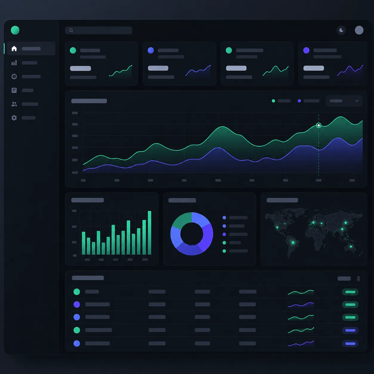
Generates UI concept designs featuring deep slate backgrounds, electric blue accents, and modern typography.
UI/UX design of a modern fintech analytics web application, dark mode theme (#0B0F19 background), sleek typography, glowing micro-charts, clean navigation sidebar with glowing icons, Bento grid layout, subtle glassmorphism borders, Figma Dribbble Behance trending, high resolution, crisp vectors --ar 16:10